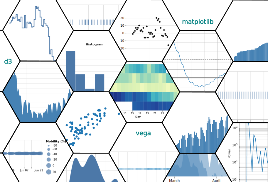
This post aims to shed some light into the visualization process, by illustrating various distinct visualizations where we keep the dataset intentionally the same (and rather simple) and we vary the applied transforms. The result is 21 distinct ways to represent the same data, illustrating the power, flexibility, but also pitfalls of visualization