A new course in the data science category offers a deep-dive into the structure of visualizations, in particular visualizations of timeseries data.
The course is now live here at the Academy
Pre-requisites and target audience
Knowledge of basic visualization techniques and mathematical notation of functions and maps. Familiarity with data series and their usage in data science. Should be useful for people who need to work with visualizations e.g., in the context of exploratory data analysis and who want to deepen their intuition about how visualizations are put together.
All visualizations are produced using open source Python or Javascript libraries but this is not a course about programming visualizations!
Summary of the Course
What we aim to achieve in this course is to deconstruct how both typical and less common visualizations of timeseries work.
In the first instance we decompose the visualization process into:
- A mathematical transformation, which (optionally) may operate on the raw data and produce new representations thereof
- A visual transformation, which converts quantitative data into a visual space
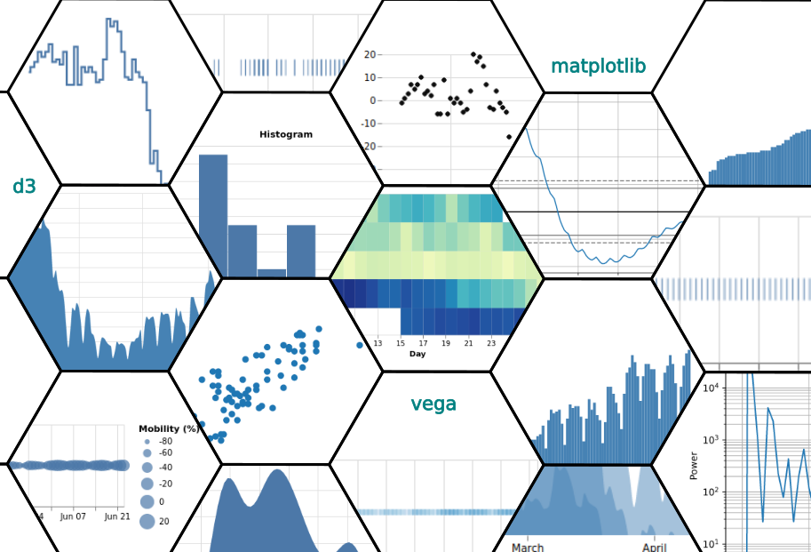
We apply this "recipe" to a large number of visualizations (21 in total), using always the same simple data series. The result is an exploration of the many diverse ways visualization can help extract meaning from data. The steps of course:
21 ways to visualize a simple timeseries
- A Numerical Table is also a Visualization
- Visualizing Observation Times
- Visualizing Observation Values
- Color Plots of Measurement Values
- Bubble Plots of Measurement Values
- Scatter Plots and their Limitations
- Linear Line Plot and Continuity
- The Step Plot and Discreteness
- The Smooth Plot: Pleasant but with a stinging tail
- The Area Chart: Filling up space to our advantage
- New Visualization Horizons with the Horizon Chart
- Abusing the Bar Chart Concept
- A Sorted Bar Chart and the power of mathematical transformations
- 14. The Histogram Transformation
- The (Probability) Density Plot and Mathematical Models
- The Lag Plot and Persistence
- Autocorrelation and further Arcana
- The Phase Diagram and Dynamical Systems
- Displaying data in the Frequency domain
- A Calendar is also a Visualization
- The Plot Thickens: The Weekly Calendar Version